The Loft: A Minimalist Project
In November of 2020, we were contacted by a San Francisco couple who had recently purchased one of the lofts on Florence Avenue, here in Sebastopol. The Florence Lofts is a live-work project with twelve units, each with 620 square feet of office space and 900 square feet of living quarters built on a 1.3 acre parcel just steps from downtown Sebastopol.
The complex was created in 2008 by Steven Sheldona local architect. At first glance the project looks quite simple, but actually has some of the most innovative energy-saving conservation systems concealed under its unassuming shell.
The exterior façade is stucco with a swath of warm, rusted metal trellis structures, that envelope the buildings and wind their way through the property. The buildings utilize an extensive array of sustainable building materials, leading-edge technologies and advances in environmental and green building practices.
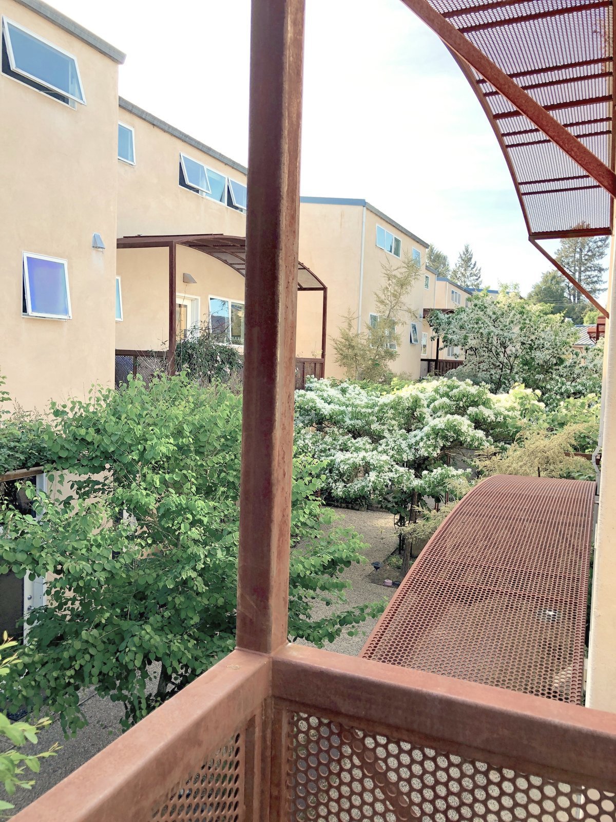
The core principles of eco-sensitivity is still ahead of its time, with thoughtful building that utilizes window placement for daylighting, concrete flooring to create internal solar mass which provides heat in the winter and allows it to remain cool in the summer. The exterior walls are plaster over steel studs and steel roof provides fire resistance, which is vital now in Sonoma County with what has become a longer and more active fire season.
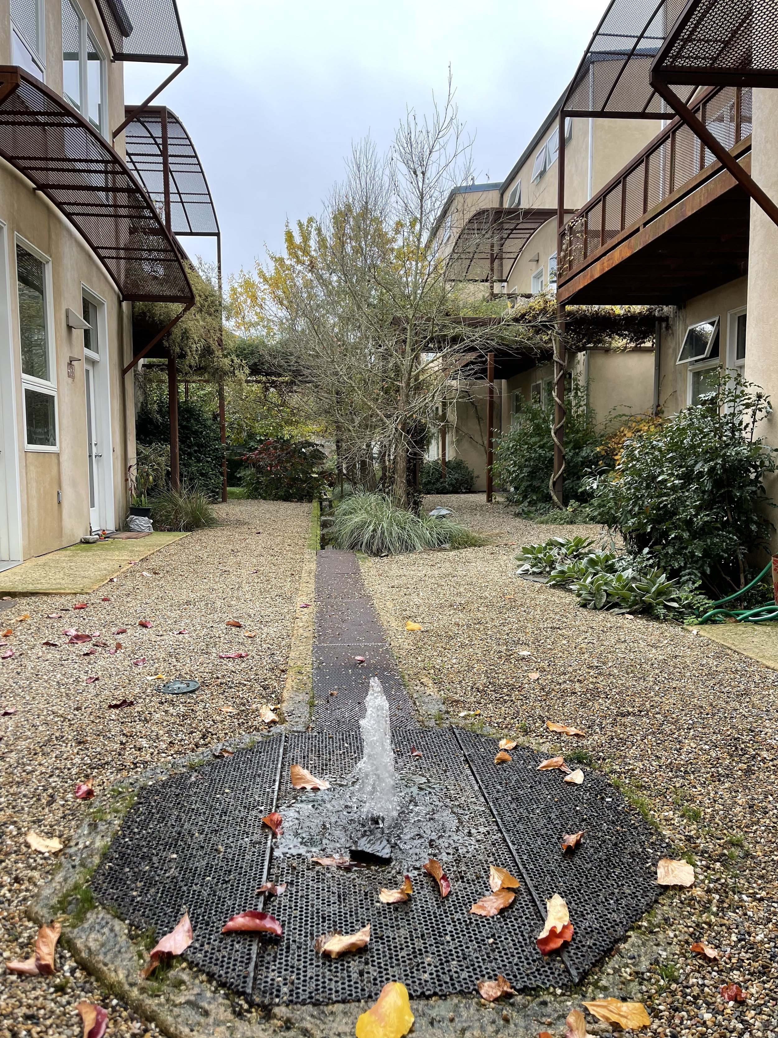
The complex was the first permanent gray water recycling system permitted through Sonoma County. The system allowed the landscaping to be broadened from just drought resistant plants to a larger palate of flowering and fragrant varieties which creates beautiful grounds in the center common area. It is both wild and manicured all at once, and provides a feeling of privacy in an area that is a travel way and shared space. The gray water from each of the 12 units is captured, filtered and pumped into a storage tank which feeds a beautiful central water feature and underground irrigation system that waters the common area.
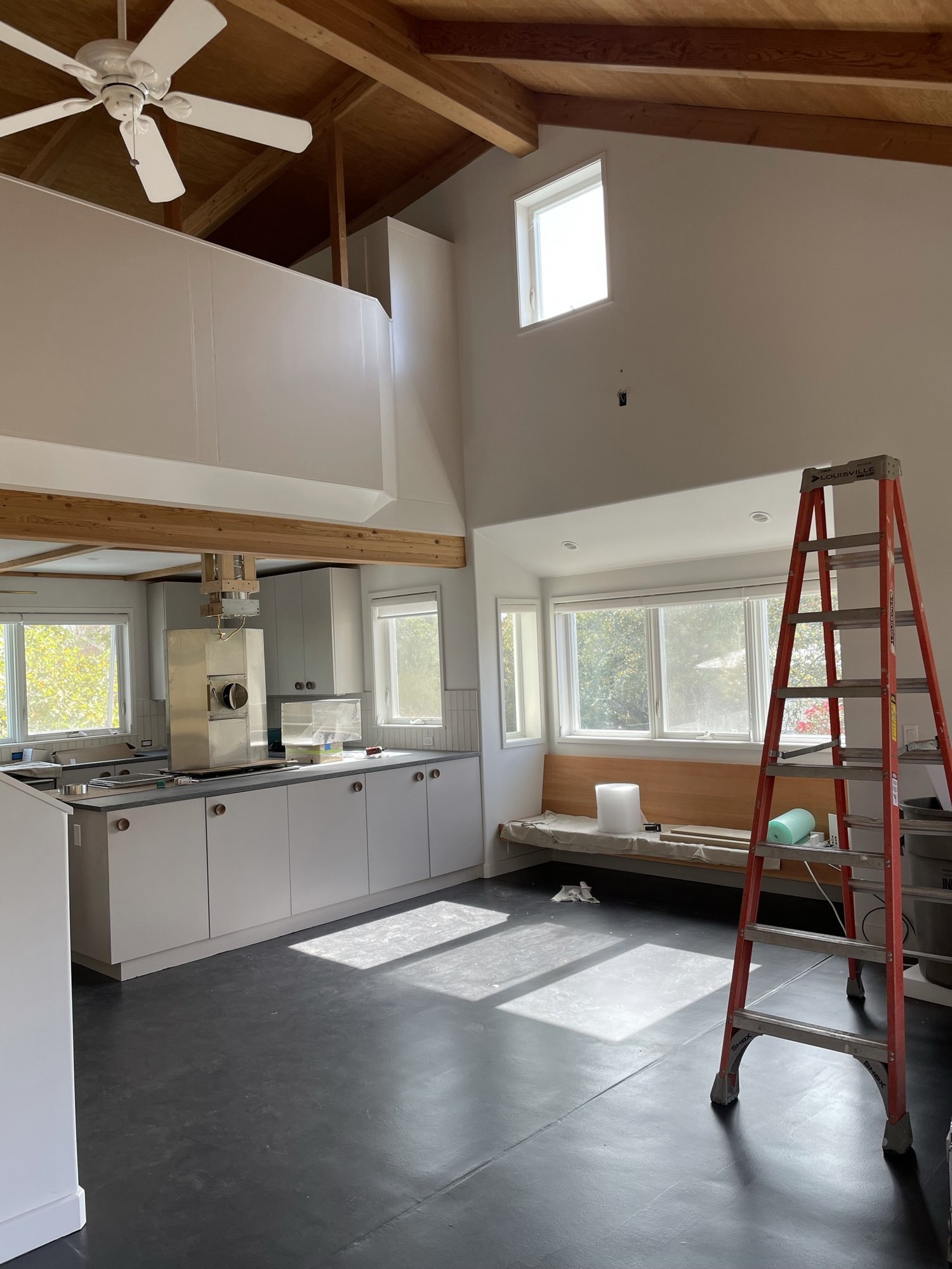
The three story unit was in generally good shape structurally, but was in desperate need of updating.
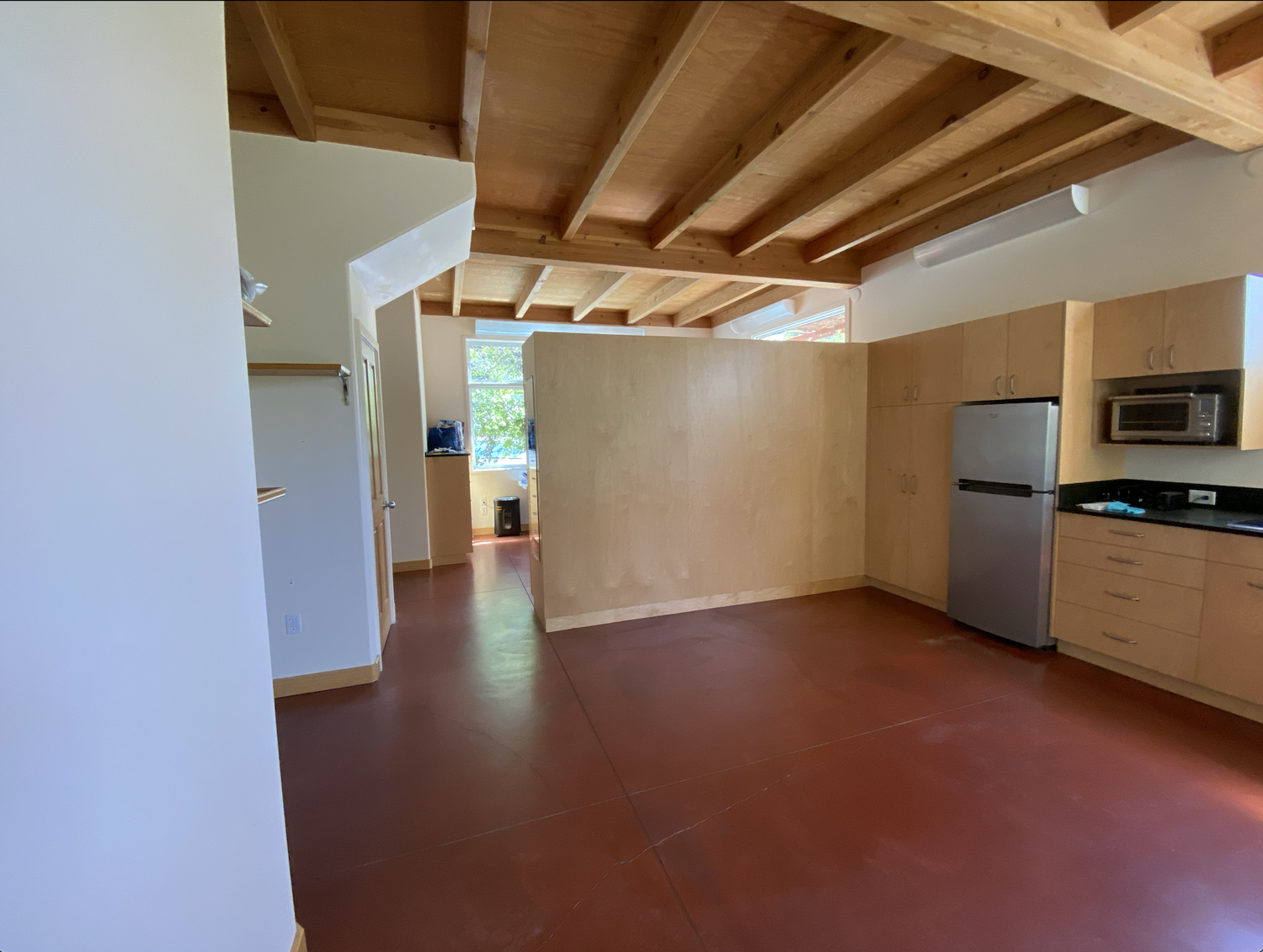
It was saturated with the materials, colors and tones of early 2000. On our first walk through the sheer quantity and mass of plywood and orange concrete spoke a bit too loudly and failed to amplify what was truly beautiful about the space.
The goal for our client was to modernize and lighten and brighten the three-level space.
We would address the cabinetry, improve the lighting, gut all three bathrooms and update the first floor work kitchen and the 2nd level residential kitchen.
To start, we took a big picture approach to what would stay and what would go, or be re-imagined with new paint, wood or tile. All the existing cabinetry was plywood slab doors and boxes and read very similar to the ceilings. We wanted to differentiate between the two to create a bit of height and distance between materials.
In both of the kitchen areas, we painted the existing cabinetry a warm, taupe gray. In the bathrooms we used vertical grain, doug-fir slat style doors and skinned (covered over) some of the existing boxes. We felt it created a nice balance of both warm and cool elements, which spoke to our design concept.
The concrete floors were stained a deep burnt orange which dated the space and didn’t provide the grounding element we were imagining. We chose a mid-range charcoal epoxy coating and had our painter cover the concrete on both the first and second levels.
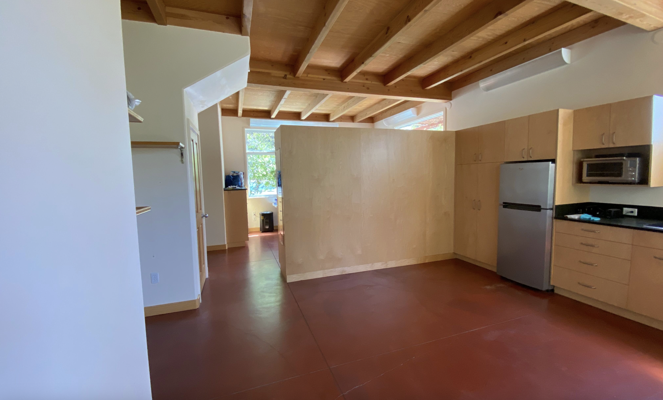
Here are the old first and second floor kitchens.
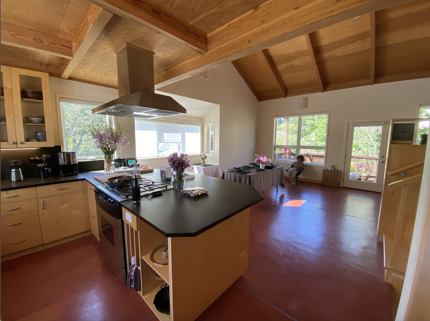
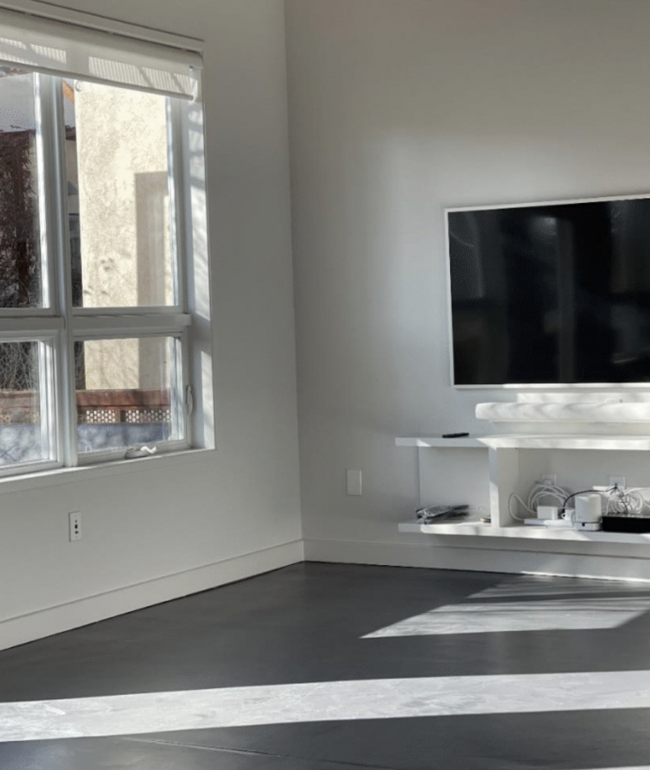
And the concrete with epoxy finish completed.
The design built off of our inspiration and interpretation of Japanese Modernism.
Japanese design is based on the principles of minimalism, the power of emptiness, a neutral color palette and a sense of unity with nature.
Our interpretation of Japanese Modernism is the philosophy of uncluttered spaces with high functionality. Smart floor plans that use the most of smaller spaces, but feel open, simple and serene.The use of mostly natural or natural looking materials that bring the outdoors in and splashes of color that add the counter weight of drama and energy. This use of color is what we consider the“modern” element added to the principle of Japanese design.

We used graphic black and white terrazzo and man-made concrete countertops mixed with vertical grain doug fir, used in counters on some levels and in cabinetry on others, and accents of deep green and red. We mixed in antique brass in lighting fixtures as well as painted metal in green and red to round out the color and material scheme.
The impact of the sharp contrast between the black and white, the feeling of stone in the imagery, the use of green like fields of rain drenched grass brought in the feeling of nature into the spaces. The wood we selected, doug-fir, offset all the cool tones and added a warmth, an earth tone, that worked really well with the existing ceilings and beams.
A simple design but also quietly striking which seemed perfect for the space and our clients.
Step two was a look at the floor plan on the three levels to determine if anything needed tweaking to make it more functional and efficient.
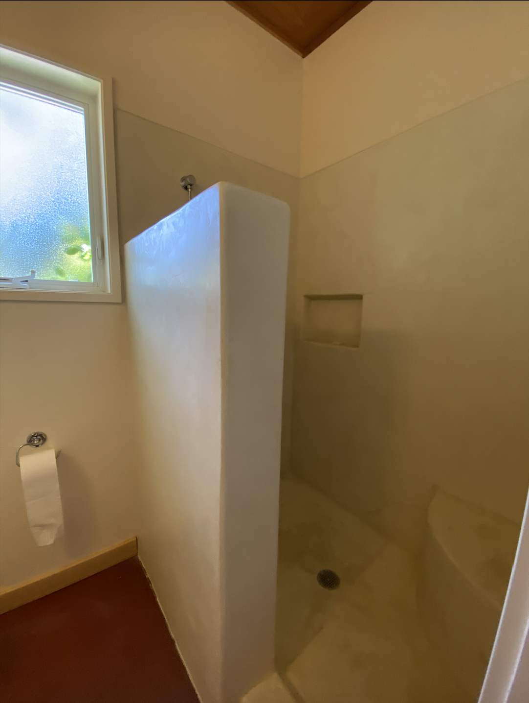
The bathroom on level 1 didn’t need a change to the floor plan itself but needed the ultra-thick, plaster like wall to be removed and replaced with a shorter, slimmer pony wall with a glass top which let in more natural light and helped with adding a feeling of more space in the room.
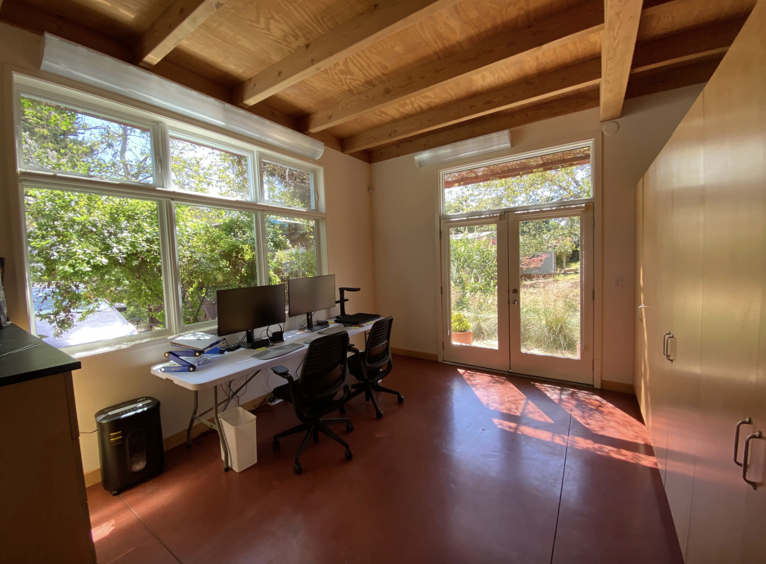
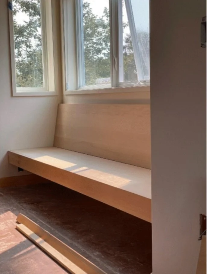
The main living area on level 1 was designed for a work area with a kitchenette area on one end and work area with a full height cabinet separating the two. We wanted to create a built-in desk area that included a fold out bed, with a screen system to hide the sleeping area when in use, but would allow an open concept when not, and a secondary standing working station to round out the work area.
Our client’s needed a truly functional space to build and grow their new Company, ChromaDiverse, which works with dance companies nationwide to create digital archives and enables their clients to tell their individual stories of dance through captured images.
Here is the first floor before.
And after.

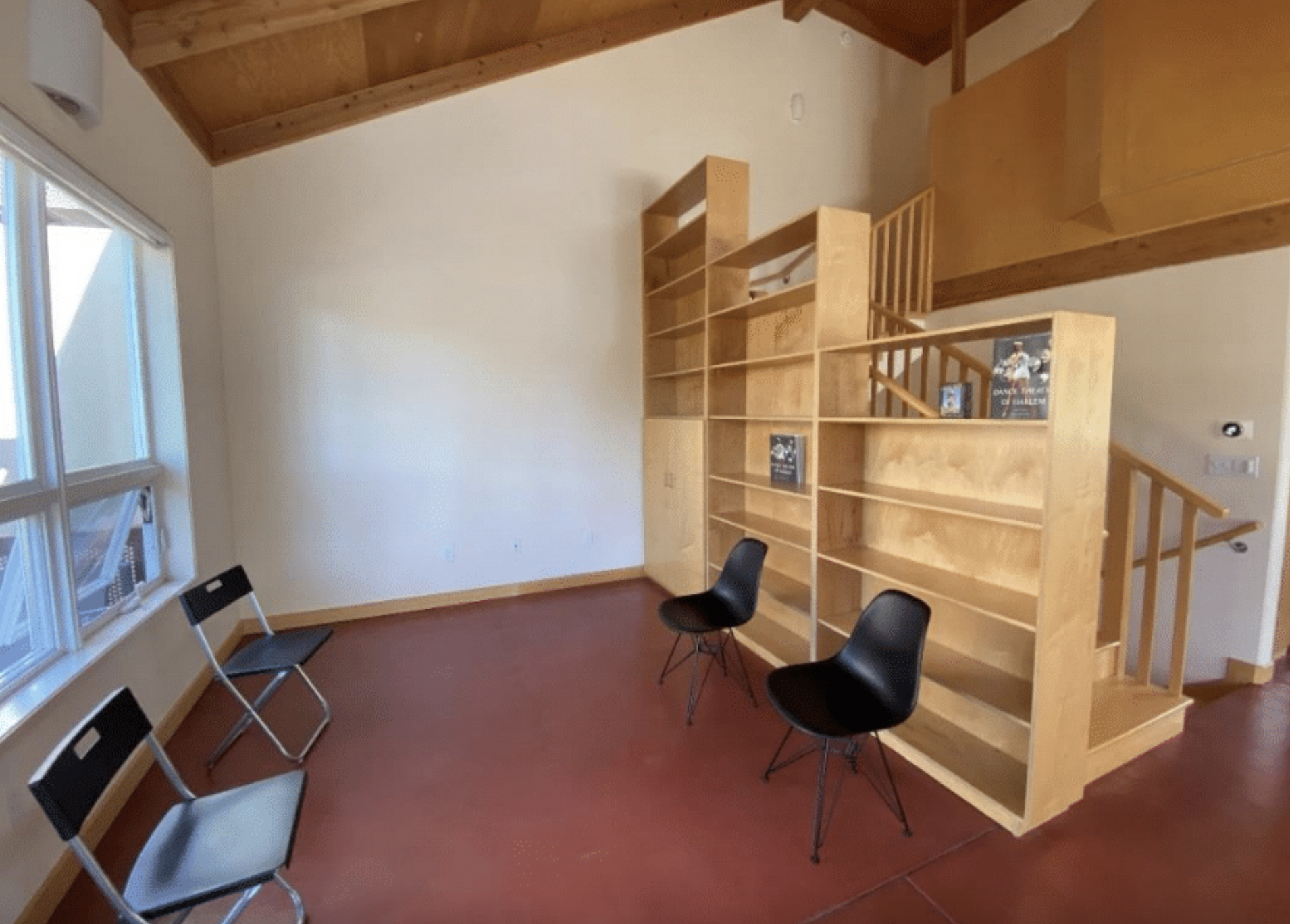
The second floor level, which is the main living area of the residential space, had an unusual open shelving unit. The bookcase acted as a side wall for the staircase which led to the third level. It intruded into the small living room area making a small space even tighter and awkward. It was incredibly important for us to clean up the architectural element and gain as much possible floorspace, through what would be a fairly minor adjustment.
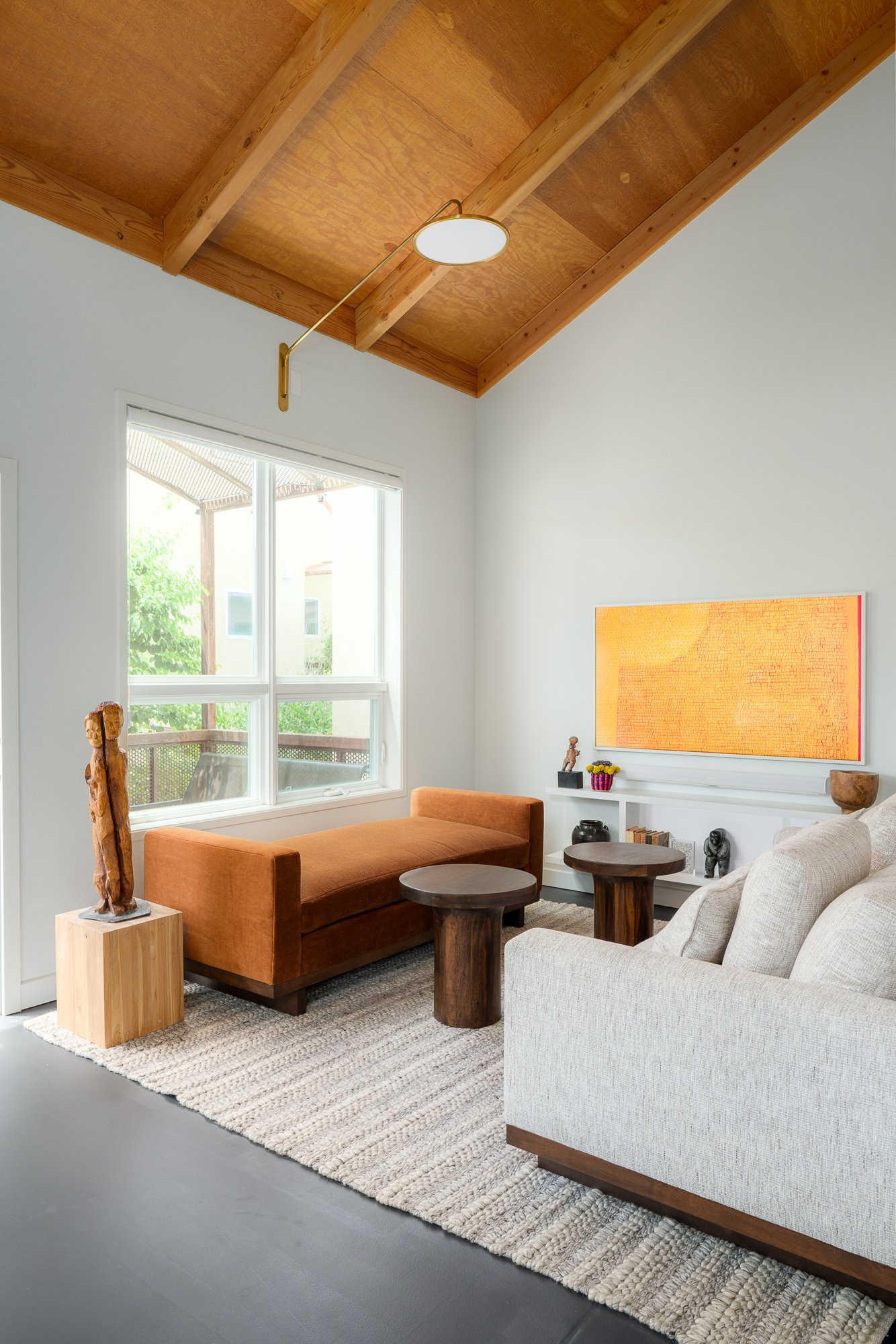
We also added a built-in bench for a casual seating area which created a more inviting dining room. We consistently find that creating areas that are defined by some type of architectural element creates the feeling of rooms in open areas. This concept adds a functional component as well as a feeling component to spaces.
We used these Visual Comfort sconces with an extra long arm to extend the light out into the space as the ceilings were pitched with no room to add can lighting. It is a functional and beautiful way to add general base lighting.

Level three, the primary bedroom and bath had a large plaster tub which took up a huge amount of floor space and was not a functional element for our clients. We removed and opened up the wall to add a bit of square footage which allowed us to increase the vanity size, add a second sink and create a good sized walk-in shower.
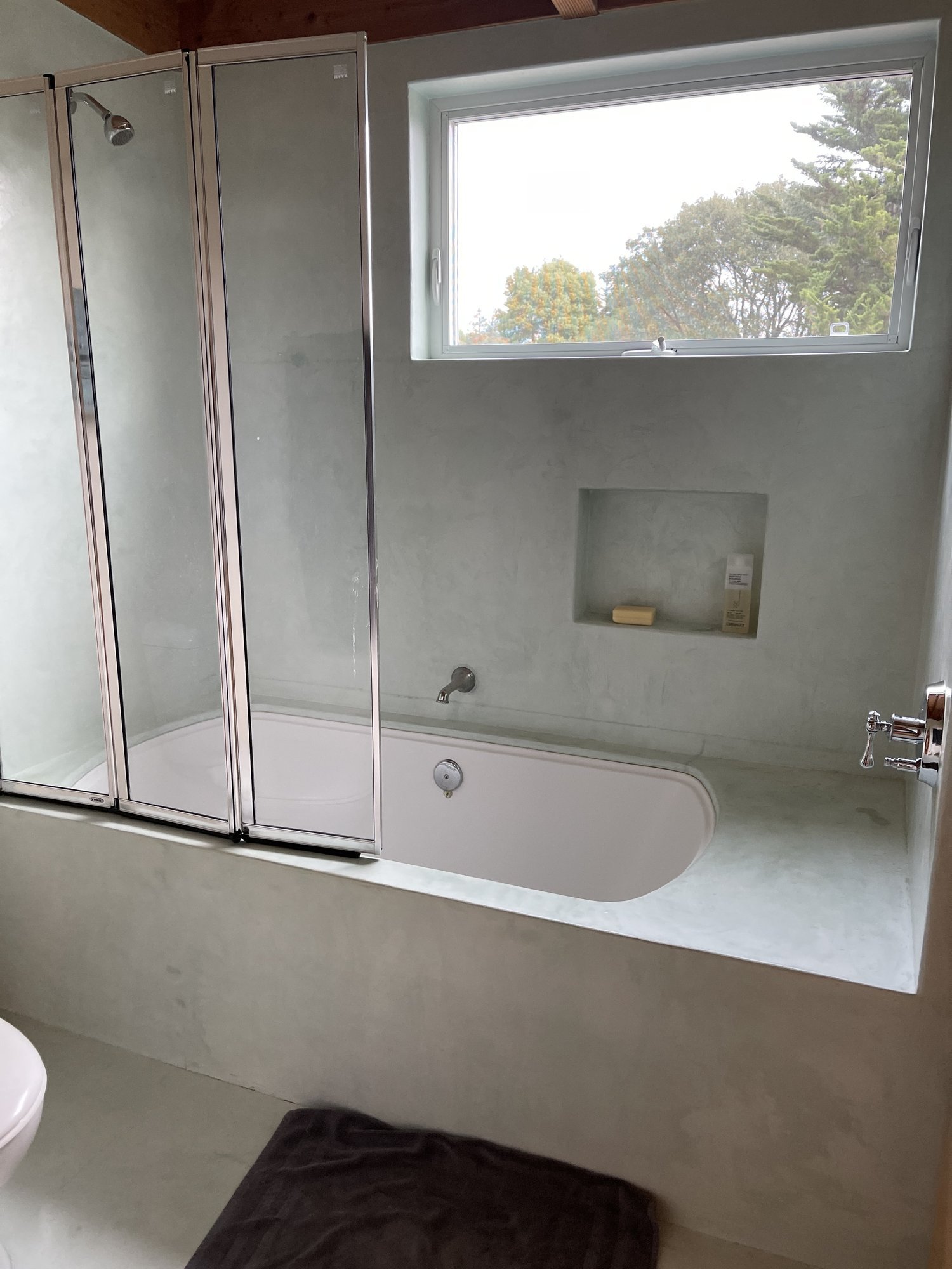
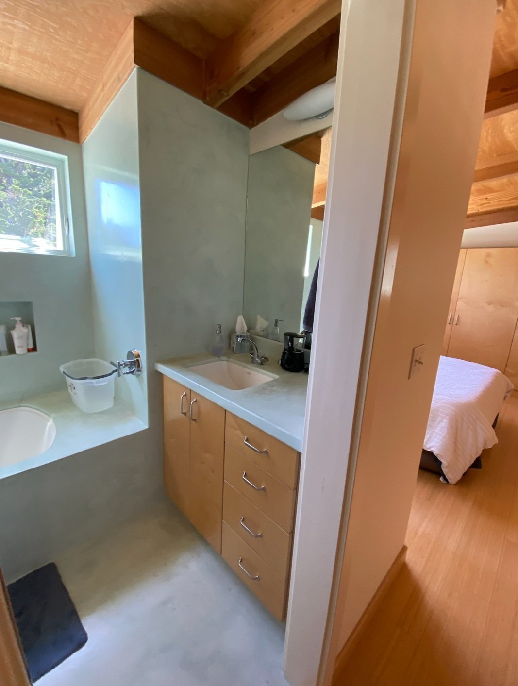
The slight wall adjustment created a much larger feeling bathroom for a smarter use of existing space. We continued with the aesthetic theme of natural feeling materials with a light hand of drama in the green splash tile which goes from counter to ceiling above the vanity.

A look at the design board for furnishing the loft spaces. We used lots of warm tones of cinnamon, a pale-yellow green, wheat and red.

Second level after with a peek of the kitchen and a full view of the kitchen after.


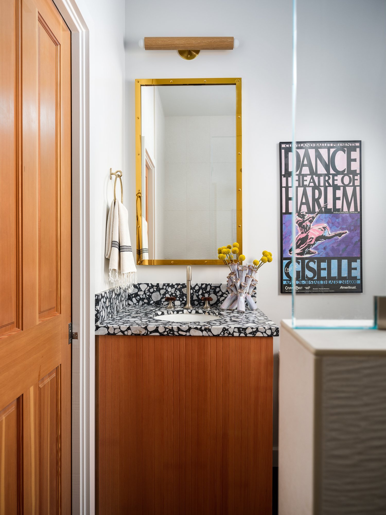
Powder bath showcasing Schumacher Shanghai Peacock wallpaper adds just the right amount of drama appropriate for this loft space.

The third level master bedroom is minimal but keeping the furnishings to just the necessary pieces and showcasing the bed against the wheat raffia wall coverings create the perfect primary suite.

Such a fun project and transformation of a really special space. This project has been featured in Dwell and Sonoma Magazine. View the final portfolio page of this project here.