Just the right hue…this time in green
Looking back over the last few years, green has made its way into many of our designs. The right shade of green can make a room feel vibrant and exotic, but it can also have a relaxing characteristic. It is all about the hue.
I chose five projects to share that used different shades of green, in different spaces, and for different purposes. These only begin to illustrate the potential of green as your accent color. When working with green, consider the lighting carefully. As with most colors, a shade of green can dramatically change from one room to another.

We love a good punch of color on an entry door. This darling bungalow selection was Benjamin Moore’s Bunker Hill Green (566). Does this not scream welcome!

We also love a pop of color in furnishings. This vintage piece was painted Sherwin Williams Oakmoss (SW 6180). This green felt right for this piece, fresh but vintage at the same time. Love the bun feet in green!

This pretty island was Benjamin Moore’s Vintage Vogue (462). A truly solid green, that works well with white and beautifully with dark wood.

Also Vintage Vogue on this bath vanity. You can see how light changes the look of the color in a space. This is what makes color tricky…
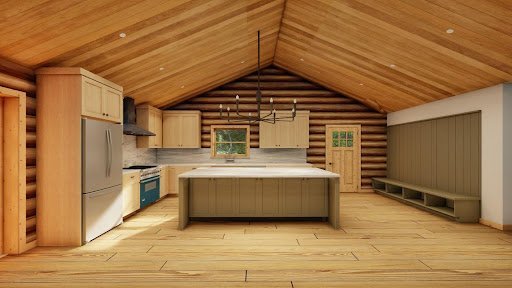
We are also working on a new construction project for a log cabin up in the Yuba area. We are incorporating green into cabinetry and wall treatments as it speaks to the natural surroundings as well as being one of our favorite colors. We used two colors, both from Benjamin Moore, Eucalyptus Leaf (2144-20) and Trailing Vines (1505) which lean more towards olive.

Eucalyptus Leaf (2144-20), Trailing Vines (1505)
So, that is a recap of some recent favorites that we have used in our interior design projects.
Here are a few lighter green versions that I think would be fun to use.
And a few muddy versions.

Fernwood Green (2145-40), Vale Mist (1494), Oil Cloth (CSP-760), Rolling Hills (1497)
Then there are these mid tone versions.

Pine Brook (490), Palmer Green (CW-475), Dakota Woods Green (2139-20)

Gloucester Sage (HC-100), Cabin Fever (1540), Dark Olive (2140-30), Southern Vine (2138-10)
And finally, some good dark versions…

Fatique Green (2140-10), Salamander (2050-10), Deep River (1582)
I love that adding green to your design scheme is like bringing the outside in. As Interior Designers in Northern California, this is always an element we love. It is such a versatile color that can work on cabinetry, walls, ceilings, wall treatments, and trim. It can be calming and can also add drama, depending on how you use it and in what locations. Really, what is the most important is choosing the right shade. I hope that we have shared a color or two that you will be inspired to use!
Cheers, Tama
Photo Credits: Christopher Stark and Brian McCloud