Just the Right Hue
Life around here has been really busy with on-going projects, new clients, meetings and planning. I have not had as much time as I would like to put towards curating new finds. But, I have had a bit of time to put together my current go-to paint favorites. Benjamin Moore is my paint of choice. They have a lovely selection of historic and traditional colors. Their paints tend to be the more classic, grayed colors, which suit my design style quite nicely.
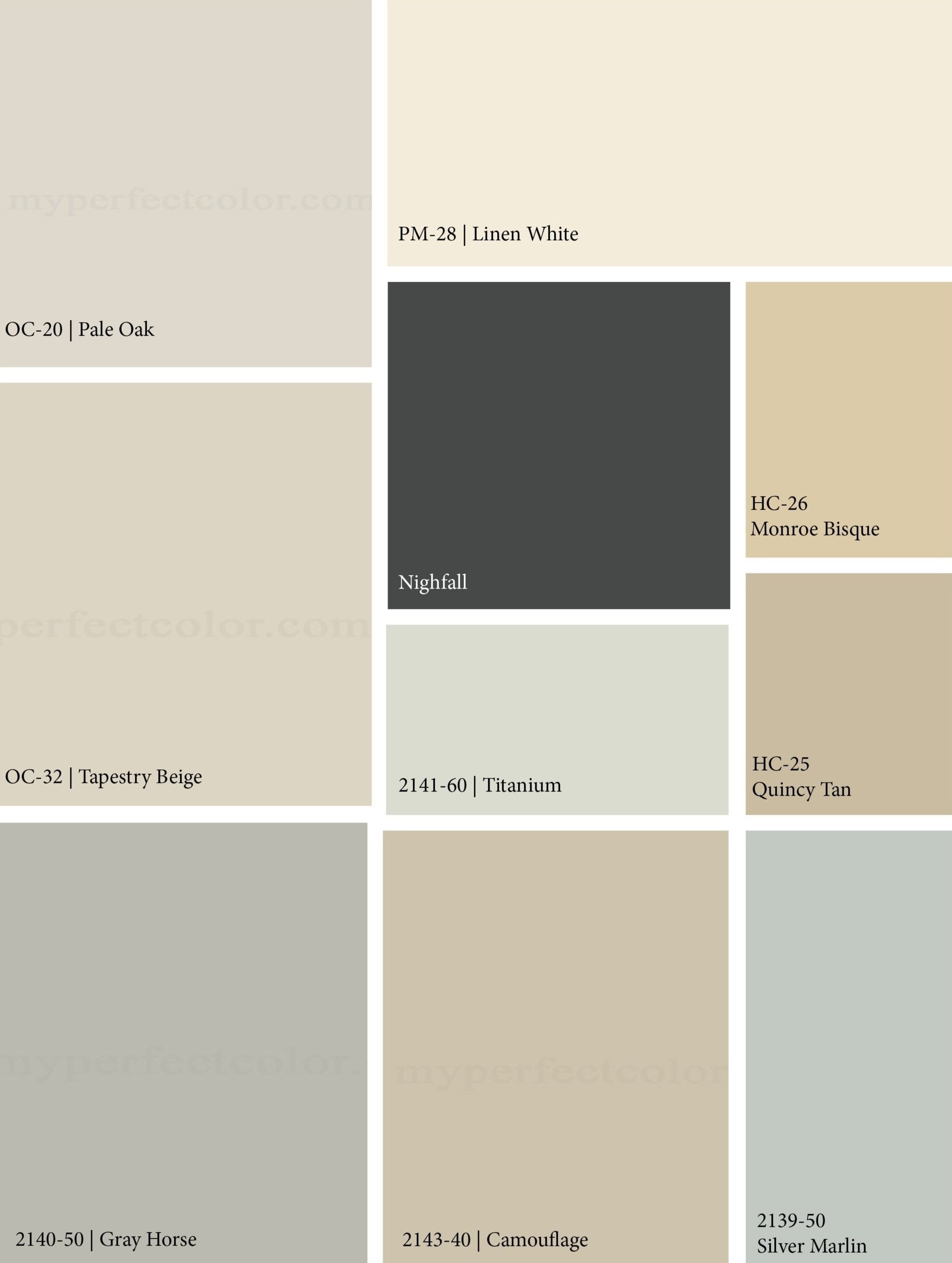
I wanted to put together a grouping of colors that would work together or independently for design projects - really a family of colors that work well as a whole. I am a fan of neutral colors that speak to our incredible Sonoma County, wine country location. These make me think of sand and sea, farm and sky. Pale linens, blues, grays to be accented by punches of color in art and fabrics. That's my style. And, here they are...
Paint Mosaic
I also like to have a couple of deeper, darker, options if I want to accent or add drama to a wall, room or space. I don't like to over use this concept, but, sometimes, in the right space, and in the right way, it can be just what the design gods ordered!
On the spot, if I had to pick my three favorites (even though it feels like being made to pick your favorite child) they would have to be Tapestry Beige, Titanium and Nightfall.

Tri Color
Tapestry beige is a gorgeous neutral that is soft and hints at green without being overbearing. It pairs beautifully with wood tones and accents of colors in hues of pink and red.

Tapestry Beige
Titanium is another lovely neutral color that carries some blue and green undertones and works really well with white and sand tones. It adds a bit of contemporary splash to a space.

2141-60
Nightfall was an unexpected favorite. I wanted to add a feature wall behind my desk in my design studio where I was going to hang a large acrylic black and white, John Anderson piece. Nightfall is a deep charcoal color, but it is not heavy or dark. It is energetic in its deepness, which gives it life. It pairs beautifully with Swiss Coffee to create a modern feel. I love this color. I will use it again along the design road...

Tri Color 3
That brings me to an interesting color challenge that I ran into this last week: understanding and studying color and undertones. Color is amazing and frustrating all at the same time. When you are perusing the paint chip isle in your favorite paint store what you first see is the color's mass tone. The more challenging aspect can be the color's undertone, which can often be concealed when you are looking at the swatch.
So in general terms, here is how it works. True colors have a mass tone and an undertone that are very close to the same hue.
hue: a color or shade. the attribute of a color by virtue of which it is discernible as red, green, etc., and which is dependent on its dominant wavelength, and independent of intensity or lightness.
Some undertones are simple to see and some colors, especially neutrals, are more complex and have less pure color which makes it more difficult to determine undertones. Undertones are very important when creating a color scheme as the undertones can fight each other and not be harmonious. Clashing undertones can ruin a scheme. Listen, clashing anything is not good.
The easiest way to see the undertone is to compare it to other colors. Place the color next to colors from the same family or next to the true color. Example, place your blue next to a true blue and the undertones will appear. Whites place next to a true white and the undertone will become apparent.
Neutrals can be a bit trickier. Place the color next to its pure color such as, blue, green, red, and yellow and remember the color wheel. So a neutral with a green undertone placed next to red will bring out the green undertone because they are complimentary colors. Try your paint color next to each until you feel you have determined the undertone. This seems tedious but with time and practice the undertones will become more apparent and your creations will become more harmonious!

Color Wheel
Back to my color challenge. In this case, the client had an existing stone fireplace that was staying but the room needed repainting. The fireplace stone had some brown and grey but also had tones of pink and orange, think the color of salmon flagstone.

Tri Color 2
We wanted to choose a color in the gray, taupe neck of the woods that would pair nicely with the other neutral colors we had picked for the rest of the palette. If the paint had any blue undertones the stone accentuated the blues and made that the predominant tone. The trick was to find a gray that made the stone seem sharper and not accentuate the red tones. We settled on these three grays from Benjamin Moore. We will put up large swatches and select one to move forward with.
Paint is one of the easiest ways to transform or update a space. Hope this exercise helps in your color hunt!