Before & After: A Medley of Recent Interior Design Projects
I thought it would be fun to write a post with just before and after images, a transformation medley of sorts, of some more recent projects. We have been enjoying looking at where we started and seeing what was created with our design plan.
We hope that you enjoy this as much as we have here at TBD!

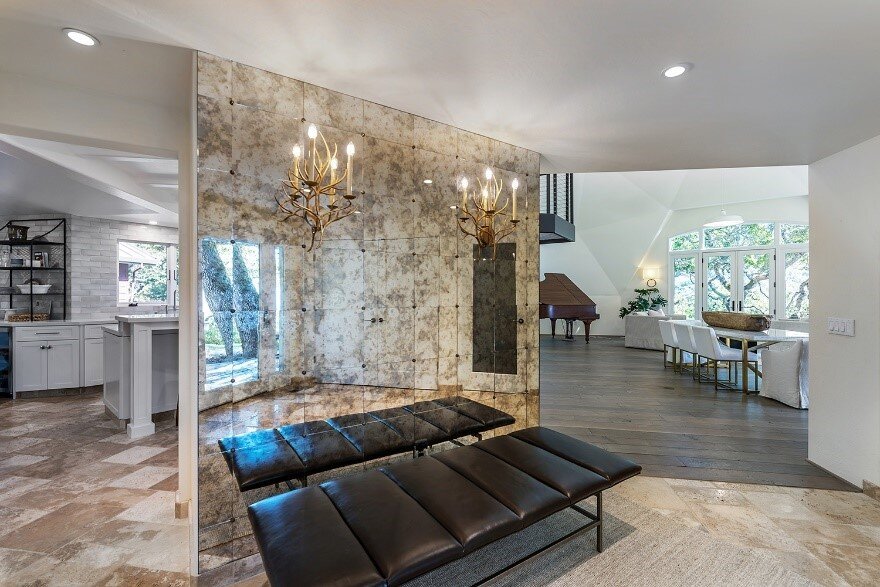
This entry space had an angled wall that made the space a little awkward. We decided to add a custom, antiqued mirror wall and add inset sconces. We think this did the trick to open up the space and let the great light from outside shine in.
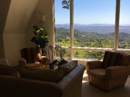
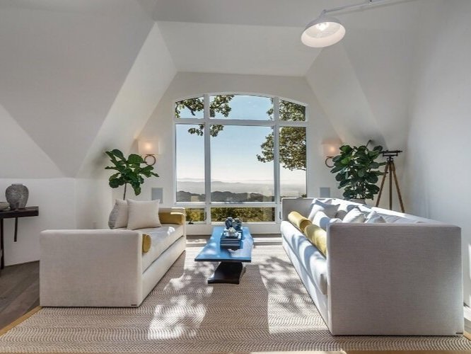
This great room, created from a dome structure, had fantastic natural light, but needed additional general lighting. At night, the lighting was on the minimal side. The dome structure created some real challenges with lighting because running new wiring was cumbersome and cost prohibitive. We were not able to add can lighting because of this. We had boxes from the old sconces on the walls. So, we got creative and added large, glossy white barn lights. This brightened up the space and extended the light farther into the dome. They added a bit of interest and architecture to the room. We then worked with an off-white and neutral palette rich with texture, that we think offsets the green accents both inside and out.


We love white and often use a combination of whites in the spaces that we design. People often think that white is stark but there is so much color in white and off-white. We think that it adds color in a way that is both comfortable, elegant, and truly lasting. It is such a great base and plays so well with the other layers that we want to add, like metal, tile and stone, textiles and art. It adds light and creates a really clean look. We love our whites!


This kitchen had a low ceiling and was a little awkward in contrast to the grand living room and family room that both adjoined it. We started with cleaning up the cable track lighting used between the beams in the ceiling (which made it feel even lower) and added can lighting. The cabinets themselves were functional so we had the boxes painted and had new doors made, all painted white, of course! We removed an upper cabinet above the bar area and had a custom metal standing shelf made to take its place. I love how this turned out and expanded the space, visually adding square footage!


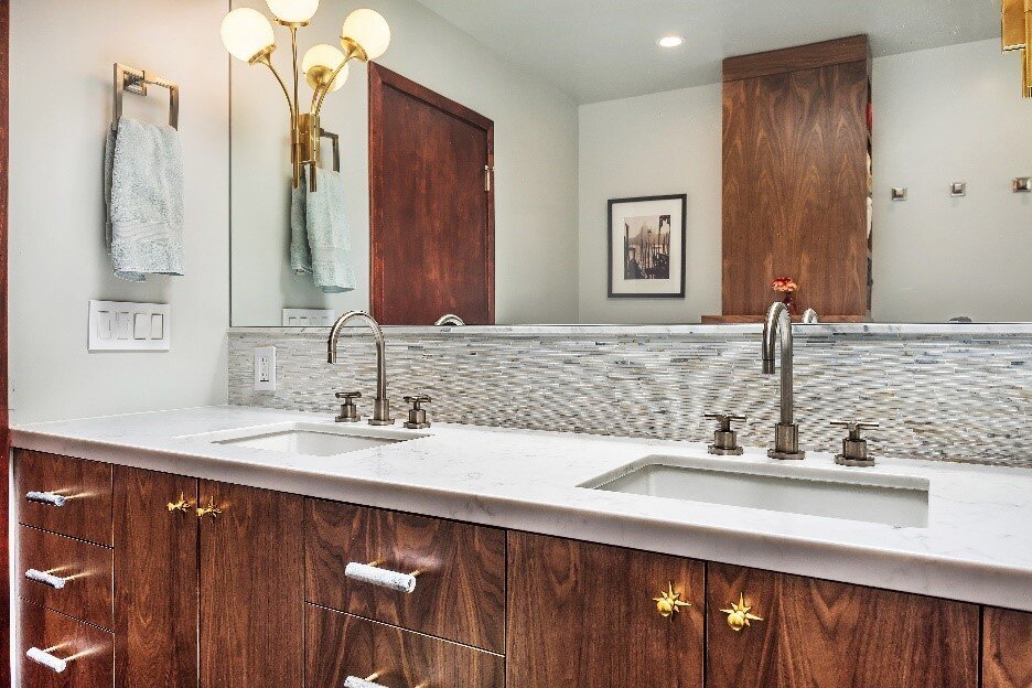
Master bath before and after. We added horizontal plank to the walls, new appropriate size vanities, gorgeous coral inspired mirrors and a bit of brass and satin nickel. Oh, and quite a bit of some really pretty marble!

A vintage guest bath redone in our version of mid-century modern. We usually work in a more traditional style and really enjoyed branching out with this style. We created floating, flat panel cabinets in black walnut with some pretty special hardware in vintage brass and black marble. I especially love how the long vanity was extended with the stacked marble splash and the custom full wall mirror with inset sconces.


This master bathroom needed some smart space planning. We don’t have a full image of the space before because it was so cut up. We removed the tub, added a large walk-in shower in it’s place, and maybe a first for us, lost some windows. But, we think it made this bath a real star.

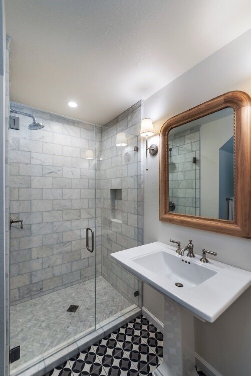
In the same project, we worked on this petite downstairs guest bath. We expanded the shower by removing a cabinet on the back side which was unnecessary, used a pedastal sink instead of a cabinet and added a little drama with patterned tile on the floor. The mirror is raw wood and the sconces are in a vintage nickel.

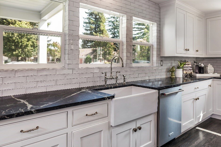

This project started with some smart space planning to open up the kitchen, dining and family room. The original kitchen space was small and set in the front corner of the home. We removed some walls and reconfigured the bathroom to create a great room for the family. We added a bank of windows at the front over the sink, tiled the splash right up to the ceiling and used a lot of white with some beautiful soapstone and deep, classic brown wood tones.


This master bath was in need of a renovation to create a simple, sophisticated feel. We designed the white oak vanity without any hardware. It reminds me of California West Coast architecture, reminiscent of William Turnbull. We tried to play off both the masculine and feminine for a balanced, elegant design.
I hope that you enjoyed seeing some of these before and after images and taking a little walk down memory lane with some of our projects. We sure did! Check out our portfolio page to see more after shots of each project and read some of our project stories!